Friday 28 September 2018

Animation Session 2

In this second session of animation we worked on movement; specifically timing & spacing, and arcs.


The first test was this, "the coin test".
Here we have two circles moving the exact same distance, but the timing and spacing is different.
This is the onion skin for this piece of animation. As you can see the top circle moves in evenly, whereas the space in the bottom circle gets wider. Having more space between frames, gives the illusion that the circle is traveling faster.

Next, Nat wanted us to create a pendulum.
This is not how to animate a pendulum.
Pendulums work in an arcing motion, whereas this doesn't.

These are pendulums.
These actually move in an arc (which is more clear in the onion skins).


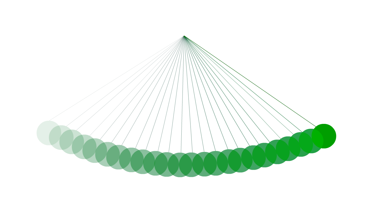
Most things in real life move in arcs more so than straight lines, so its a good thing to cover this as a basic principle of animation.

Wednesday 26 September 2018

Animation Session 1

For our first session on animation, Nat had us draw our own faces, morph them into our favourite food, then morph the food into our favourite animal and then back into our faces, creating a full GIF.
I decided to draw chicken nuggets and a velociraptor.
It's not perfect by any stretch, but I am quite pleased with this being my first proper go making an actual animation with Animate (Flash).

Digital Painting Session 2

For our second session on digital painting, Simon had us use Photoshop's polygonal lasso tool to recreate preexisting art with only 3 shades.

Firstly we selected one or two scenes from any film we wanted. I chose Spider-Man: Homecoming. Then we tried to recreate the scenes by creating abstract shapes that were black, white or 50% grey.


Here's what I created. Not going to lie, I found it difficult to replicate the scene without outright tracing. Looking at it now, I can see where I could have added extra shading.
I could have added some black where the van door is open, I could have made the sky and the window white. But we moved onto the second task of the day, before I noticed that.

We had to do the same again, but this time with another piece of art created by a famous artist. (I cannot remember who I chose, so I'll add the name here when I find out later)


Firstly, I went through and cut out all the different shades with the polygonal lasso tool. I did go back and add some detail with the brush, mostly because I was getting annoyed with the lasso. After, we was told to add some colour. Marble I white, I honestly didn't really know what to do, other than add some shades of cream and blue. I wanted to make the colours blend in a bit more, but I have no idea how to do that, so I guess I need to do some more experimenting on Photoshop.

Tuesday 25 September 2018

Review of "The Cabinet of Dr. Caligari"


The Cabinet of Dr. Caligari is a 1920 silent horror film, directed by Robert Wiene. It is an early example of German Expressionism in cinema that paved the way for developing genres and ideas for new directors. This review will also show connections between early cinema and other forms of art.
Fig 1. Das Cabinet des Dr. Caligari poster (1921)

The Cabinet of Dr. Caligari (or Das Cabinet des Dr. Caligari) is a 70 minute film about a man named Francis telling a story about a strange person called Dr. Caligari, who used a somnambulist (a sleepwalker) to commit acts of murder. While the basic plot of a hero, trying to save a woman from a villain is here, there are various plot twists and red herrings that keep the story intriguing.

Dr. Caligari was an example of German Expressionist film. German Expressionism was a movement in Germany that started just before World War 1, peaked in the 1920s and then faded out. It was one of the most influential creative moments of all time and went on to inspire major creators in many forms of media, including film directors like Alfred Hitchcock.

"I...acquired a strong German influence by working at the UFA studios [in] Berlin" - Alfred Hitchcock [Archive Footage] (Paul Merton Looks at Alfred Hitchcock, 2009)


The strange, twisted style of Caligari had a very strong influence over many different directors, notably Tim Burton. Most of Burton's films have a very strange and distinct style which can be traced back to German Expressionism and Dr. Caligari.

Related image
Fig 2. The Nightmare Before Christmas Poster (1993)

The Nightmare Before Christmas is one of Burton's most famous works. It tells the skeleton that discovers Christmas. The film takes very clear inspiration from German Expressionism, and more specifically Dr. Caligari. The design of the world seen in Nightmare Before Christmas is very reminiscent of the distorted reality seen in Dr. Caligari.

For example: the poster for Nightmare (Fig. 2) shows Jack Skellington atop a strange looking hill. Compare this to Fig. 3, which is a still from Dr. Caligari.
Both shots show strange, slanted platforms. Burton continued with making films with a distorted view of reality, creating some truly bizarre visuals in films such as Charlie and the Chocolate Factory (2005), Alice in Wonderland (2010) & Dark Shadows (2012).


Fig 3. Cesare caries Jane across the rooftops (1920)


Unlike most films which follow a 3 act structure, Dr. Caligari has 6 acts. Being a silent film, speech is shown on separate text screens that splice up the scenes. These text screens also display the act number. Along with that, the acting is extremely over the top, which was completely normal for the era. The camera was also incredibly static and was usually either a full, wide shot or a close up with a circular frame. Another thing is that almost all of the sets had a strange distorted feel to them, with the odd shapes and clearly painted textures. With all of these different elements the film feels almost like a theatrical production, which would make sense as cinema was nowhere near as common or popular as it has been in the last few decades.

“The structure of the film is accessible, with straightforward continuity editing. The camera is static and positioned front on, again recalling the theatre, and this is emphasised by the feature for which the film is most famous, its sets.” - (Dixon, 2011:41)


Image result for the cabinet of dr caligari concept art
Fig 4. Street Concept Art (1919)
As briefly mentioned before, the set design for Dr. Caligari is ver strange looking. This shows the main character's distorted view of reality. Another thing of note about the set design is that it exactly replicates the concept art used for the film.
If you compare figures 4 & 5, you will notice that both the concept art and the final set are very similar, even down to the spiked patterns on the floor.


Fig 5. Characters standing in the middle of the street (1920)


While the story of the film wasn't anything spectacular, the effects of its creation are still being felt in films today, so it cannot be argued that the film was very influential.


Bibliography


Dixon, B. (2011) 100 Silent Films. London: Palgrave Macmillan.

Paul Merton Looks at Alfred Hitchcock. (2009) BBC4. 28 February. 21.00hrs.


Image Bibliography


Figure 1. Atelier Ledl Bernhard (1921) [Poster] At: https://commons.wikimedia.org/wiki/File:Das_Cabinet_des_Dr._Caligari.JPG (Accessed on 25.09.18)

Figure 2. The Nightmare Before Christmas Poster (1993) [Poster] At: http://transcripts.wikia.com/wiki/The_Nightmare_Before_Christmas (Accessed on 25.09.18)

Figure 3. Cesare caries Jane across the rooftops. (1920) From: The Cabinet of Dr. Caligari, Directed by: Robert Wiene [Film Still] Germany: Decla-Bioscop.

Figure 4. Warm, H. (1919) [Concept Art]

Figure 5. Characters standing in the middle of the street (1920) From: The Cabinet of Dr. Caligari, Directed by: Robert Wiene [Film Still] Germany: Decla-Bioscop.

Tuesday 18 September 2018

Digital Painting Session 1

As practice for digital painting, Simon had us plan out Octavia. We created an influence map and some thumbnails.


As you can see my influence map isn't exactly great, nor was it actually finished. Since this was more practice than anything else, the ones I am actually creating for the project contain much more.


These thumbnails were the first thing I've ever actually drawn in photoshop. As you can see I forgot to number them and they are all very rough. Most of the thumbnails I'm drawing for the full project are drawn in pencil, but I might do a few on photoshop as well, just so I can get used to the program.

Major - Reflective Statement

I won't lie, if I really wanted to I could make this reflective statement just be a list of every little detail that went wrong from pre...